Responsive HTML Tables using Flex with minimal CSS
How I'm making a table heavy web application mobile responsive using Flex and minimal CSS
Introduction
I’m making a concerted effort to make the health application I work on mobile responsive. The application is table heavy as it lists all sorts of results in tables. Patient lists, Covid results, published documents and more. I wanted to make all the tables mobile responsive so that they looked good on mobile phones and tablets. The driver for this work is we’re opening up the application to non NHS staff who may want to access the data on the go in the patients home using a mobile device.
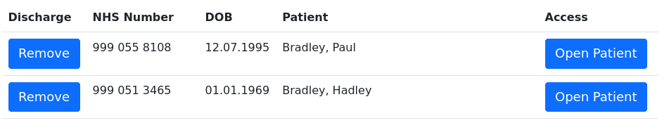
Here is sample of a patient listing. This is how it would look on a desktop computer. The table styling uses the Bootstrap CSS framework.
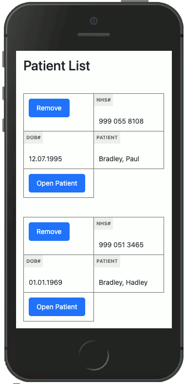
With the addition of minimal CSS and using the flex properties we can reformat the layout on smaller screens. This is how the table appears on mobile devices. The CSS hides the table headings and the column names appear within each cell as a small label.
The HTML
Below is an example table. The classes on the table tag are Bootstrap stylings. Within each td tag that we want a label to appear on the small screen version, we add the label naming within a span tag. The cell value is then wrapped within a normal paragraph tag. This allows us to style each of the components.
 1<table class="table table-condensed table-hover">
 2    <tr>
 3        <th width="70">Discharge</th>
 4        <th width="160">NHS Number</th>
 5        <th width="70">DOB</th>
 6        <th >Patient</th>
 7        <th width="170">Access</th>
 8    </tr>
 9    <tr>
10        <td><button class="btn btn-primary" type="submit">Remove</button></td>
11        <td><span>NHS#</span> <p>999 055 8108</p></td>
12        <td><span>DOB#</span> <p>12.07.1995</p></td>
13        <td><span>Patient</span> <p>Bradley, Paul</p></td>
14        <td><button class="btn btn-primary" type="submit">Open Patient</button></td>
15    </tr>
16</table>
The CSS
Below is the commented minimal CSS added to the applications style sheet which makes all tables mobile responsive. The key bits are switching the tables row display properties to flex and adding the flex-wrap statement.
 1/*
 2   default styling for the span within
 3   the table td's on screens wider than
 4   800px these are hidden and only made
 5   visible when the media query hits 800px
 6*/
 7table td span {
 8    background: #eee;
 9    color: dimgrey;
10    display: none;
11    font-size: 11px;
12    font-weight: bold;
13    padding: 5px;
14    position: absolute;
15    text-transform: uppercase;
16    top: 0;
17    left: 0;
18}
19
20@media(max-width: 800px) {
21    table tr th {
22        /* hide the table headers when on smaller screens */
23        left: -9999px;
24        position: absolute;
25        visibility: hidden;
26    }
27    table tr {
28        /* reformat the table rows */
29        border-bottom: 0;
30        display: flex;
31        flex-direction: row;
32        flex-wrap: wrap;
33        margin-bottom: 40px;
34    }
35    table td {
36        /* reformat the table columns */
37        border: 1px solid dimgrey;
38        margin: 0 -1px -1px 0;
39        position: relative;
40        width: 50%;
41    }
42    table td p {
43        /* reformat the table cell values */
44        font-size: 15px !important;
45        margin: 0;
46        padding: 25px 0 0 0 !important;
47    }
48    table td .btn {
49        /* reformat any buttons within the table */
50        font-size: 15px !important;
51    }
52    table td span {
53        display: block;
54    }
55}